Thursday, December 18, 2008
Thoughts On The Filming Process
Something else I've noticed is that when filming the exterior scenes, the mood is a lot more muted and sullen- something to do with the freezing conditions and holding all the equipment in place on the uneven ground. Inside, everyone has a lot more to contribute, is more focused, and generally has a better idea of what they want to see in their film. I can't help but imagine what the mood would have been like filming the entire sequence in wet, cramped, cold conditions late at night.
Tuesday, November 25, 2008
Personal thoughts on the Test Shoot.
Monday, November 24, 2008
BLK feedback
Also no continuity sequence link or evaluation. I know you have been very involved in the play Daniel but it won't help you to get behind.
Catch up immediately please, I will give you a day or two to sort things out.
Sunday, November 16, 2008
Initial Ideas
Wednesday, November 5, 2008
Evaluation of Preliminary Task
Who did you work with and how did you manage the task between you?
-Working on the preliminary task, my colleagues were Ben, Selina, Hannah and Mel. We all took a part of the task and kept this role throughout; Ben and I shouldered the burden of acting the scene, Selina directed the task, Mel monitored sound, and Hannah operated the camera throughout the scene. This saved time for the crew, as they knew exactly how to operate their equipment.
How did you plan your sequence? What processes did you use?
-An idea for a basic piece of interaction between two characters was thought up, and Ben wrote up a basic script, which was then fine-tuned. We then storyboarded the sequence, thus deciding what was actually going to happen, and what types of shot we would have. Then we wrote up a shooting script, giving us the order in which we needed to film the scenes.
What technology did you use to complete the task, and how did you use it?
- The equipment used while filming consisted of a camera mounted on a tripod, with a microphone and headphones attached. After filming, in post production, we used Adobe Premier Pro to edit the sequence together. This enabled us to cut out the outtakes, re-order the shots, and edit them into a continuous scene, with match on action and similar techniques.
What factors did you take into account when planning, shooting and editing?
-With a limited amount of time for our task, we organised our meetings carefully, making quick decisions between us. The location had to be in a place easy to arrive at, a place that we were allowed to film in and empty at the time that we wanted to film, so we decided on one of our media classrooms. Also, everything on the brief had to be included in the piece.
How successful was your sequence? Please identify what worked well, and with hindsight, what would you improve/ do differently?
-Overall, the sequence worked well. The shots were smooth, and the 180 degree rule remained unbroken. However, we did not get a shot-reverse-shot, and there is no real master shot, as each shot is slightly different. The different levels of the two characters works well, as does the Student's P.O.V. shot. The match on action is very good as well. If I were to it again, I would include more shots from the Student's side of the room, e.g. an over the shoulder shot.
What have you learnt from completing this task? Looking ahead, how will this learning be significant when completing the rest of your foundation coursework, do you think?
-The task has prepared me for using the camera and similar equipment, as well as translating ideas onto storyboards and shooting scripts. This first encounter with editing software has familiarised me with editing techniques, and we have learned the different tasks involved with filming, and if it is best to keep to the same task or keep switching. (There are pros and cons for both, but keeping to the same task is more efficient for the group.)
Tuesday, November 4, 2008
Research: famous film production logos
Another example is at the start of the film "The Core," in which its subject matter of the Earth's core is introduced by the familiar "Paramount Pictures" opening, when suddenly the camera arcs over as it zooms in on the Paramount mountain, then the shot takes a plummet down a crevasse, down, down, down, into the seething magma of the Earth's core. These type of productions use the fact that the introductory themes and logos of these producers are so traditional and well known that the directors can use them to turn things on their heads and make the familiar unfamiliar, but also making it more accessible to the audience.
Researching movie posters
 However, posters that came out later in the advertising campaign focused much more on the stars of the film. At the risk of being cynical, I point out that these posters also do not show much about the plot other than dynamic imagery, this time of the stars that will appear in the film. They rely on the fame of the lead actors to create interest in the film.
The advertisers rely on the fame of the actor, and then create an intense and dynamic background to excite the audience.
However, if the film is a sequel, part of an established series, the name of the series and an image of the star of that series are familiar enough to introduce the film, and the film merely has to be shown to be as exciting and dynamic as its predecessors.
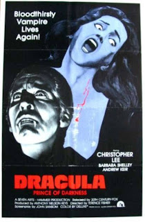 This poster for Dracula: Prince of Darkness relys on the established fame and set pieces (e.g. Christopher Lee, beautiful women meeting nasty ends) of the series and its star to attract the audience that has seen the previous Dracula films.
Research: Scripting
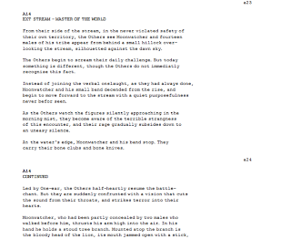
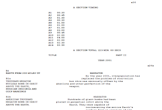
These screenshots from a movie script (2001: A Space Odyssey) show the huge emphasis on explicit direction in the script. There are large chunks written describing each individual shot. The script does not actually describe the shot, but gives a huge amount of plot detail, telling the story as it would be in a book. From this, the director creates a scene, with appropriate direction based on the story as they have been told in the script. The scripr then directs how long each shot and the the section as a whole are expected to last. This means that the director knows how much time to aim to show the scene in.
The dialogue of the script runs down the centre of the page, while the images that are going to be displayed during this are shown to the left. Thus the director, reading the script, can match the scene directions up to the scripted speech.
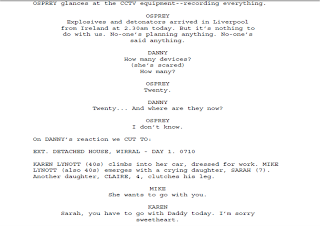
In this extract from a television script (Spooks) the differences are obvious. The directions are much more concise and to the point, giving the scene, the people and objects in it, and the ages of any characters introduced in the shot. This is followed by the dialogue of the characters as scripted, with the action interspersed as it happens in the scene. This means that the director and actors already know when events happen within a scene.
This shows that movie directors are given much more responsibility within exactly what happens within a scene and when, and that, more importantly, they are allowed a larger interpretation of the narrative. In comparison, television directors have a less prominent job, but still have an important task in set design, deciding on the "look" of the set, and the type of shots used in the scene. It is worth noting that movie directors usually achieve far greater fame than those in television.
Friday, October 24, 2008
Stars and Film Plots
I also would cast Sean Bean in Plot Seven. He would be a good match for the role, as he is well known to audiences in more than one country, and is known for his varied roles in various action related genres. He is usually cast as experienced fighters because of his rough appearance, and would thus fit into the part quite well, and be believable as a post-apocalyptic survivor.
Monday, October 6, 2008
Research: Continuity analysis
At the start of this short excerpt from Back To The Future, the camera shot is a close-up of the remote control in the Doc's hands, showing that the scene is focused on the use of this gadget.
At 0:11, the picture cuts to a two-shot of the Doc and Marty, with the remote control in the Doc's hands, establishing who is holding and controlling the already seen control. This two-shot, during which Doc tells Marty to use the camera to film the event, shows who is witnessing the scene and what they are doing.
At 0:15, the scene returns to the remote control, a little closer than before, showing the controls being operated. In the background, the car begins to move, operated from the remote control. The focus shifts from the control to the car, and follows the car's movement along the track, making it evident that the control is operating the car.
At 0:21, it returns briefly to the two shot, before cutting back to the car skidding and twisting along the track. The scene returns to the two shot at 0:25, showing the reactions of the characters to the success of the remote controlling.
At 0:28 the scene returns again to one of the main shots of the scene, a close up of the remote control, with the car in the far distance. This cuts to a shot of the car screeching to a halt, slowing to stop close to the camera, in an extreme close up of the wheel.
At 0:32, the two shot shows the characters moving in response to the movements of the car. From 0:33 to 0:39, there is a series of shots of the car skidding backwards, showing that the car is moving rapidly.
This is followed at 0:39 by the Doc and Marty moving across the track, followed by a camera pan to show them taking up position some metres away, with a brief shot long shot of their backs. At 0:45, we are shown the new two-shot, showing the new position of the characters. Marty and the Doc talk, and the Doc tells Marty that he is going to bring the car to 88 miles per hour, followed by a close-up of the remote control at 0:53, showing him activiating the controls, as he said he would. At 0:56, the wheels of the car are shown spinning in response to this action.
The shot then cuts to an extreme close-up of the control, as the Doc increases the power, followed by another shot of the car's wheels spinning, but this time from a different angle, with the car looking more imposing and dramatic.
The extreme close up of the remote control, which has a display of the speed of the car, and is thus the focal point of the scene, is returned to at 1:01. The wheels of the car continue to spin, shown at 1:02, with the camera panning around to a mid shot of the dog in the car. Another close up of the control is shown at 1:06, and the two shot of the main characters is again shown at 1:09, the control still in Doc's hands. The extreme close up of the car speed is shwon at 1:16 and 1:19, as the speed increases towards 88 mph. Then we are shown the Doc flicking a switch, followed by the car moving, showing that the switch that was just activated in the last shot released the brakes. We are then shown a series of shots at differnet angles showing the car moving at high speeds along the tracks, displaying how fast the car is travelling. At 1:23 the shot is of the dog in the front of the car, showing the car juddering at the high speeds it is still travelling at.
At 1:25 we are shown the scene from the dog's point of view, the car zooming along the track at high speeds. At 1:26 we return to the two shot, and the characters' reactions to the car travelling towards them at high speeds. This is followed by a shot of the backs' of the characters, with the car speeding towards them. At 1:28, the display of the speed of the car is again shown, continuing the build up of speed. This is followed by a close up of the dog in the driver's seat, still quite calm. Then a very extreme close up of the speed of the car hitting the all important 88 mph, followed by several shots of what the result of this is, with the dog in the car looking up as lights light up all around it, then a long shot of the car at 1:32 as it begins to time travel, the camera following the car as it continues across the ground. At 1:36, the reactions of the characters to this (shock, wonder) are shown. At 1:37, the car is shown travelling moving into the space, before disappearing as it time travels, quickly cutting to a mid shot of the characters' lower halves, as lines of fire travel throung between their legs. The quick cutting here creates a visual confusion on the eyes meaning that the audience doesn't quite catch what happened when the car time-travelled.
At 1:39, the characters look behind themselves in a long shot at the streaks of fire continue on the same route as the car was going. This is followed at 1:41 by a mid close up of the characters still gazing after the streaks of fire, trying to comprehend what has happened. At 1:48, they turn back as Doc celebrates (in a mid shot) his invention, but the audience sees at 1:52 what Marty sees; the burnt numberplate of the car spinning around before clattering to the ground. The continuity of this action scene involves many quick shots to confuse the eye, particularly at the moment of time travel, but also to get across the speed at whicjh events are happening, and the two character's reactions to these events.
Wednesday, October 1, 2008
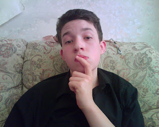
Something About Me:
Tuesday, September 30, 2008
BLK feedback
great clips and analysis - you're getting more technical by the day Daniel!
Ask me about the clips and we'll sort them out.
Research: Types of Camera shot in film clips
This is a scene from the first Pirates of the Carribean film. Not the first film that springs to mind, I know, but there's some good camera work in it:
- 0:00- big close up so that the audience cannot see the entire scene and does not know what is going on- only a reaction to what is happening.
- 0:10- long shot to show the main focus of the scene.
- 0:14- Mid- close up to show his reaction to this action.
- 0:16- Forward track following his movements across the scene to capture his struggle to cross the sand.
- 0:20- Moving subject into space: he travels forward so that camera has both characters and the fire in the background, while the continuity that he has been running towards her is upheld.
- 0:28- Over the shoulder shot to more effectively capture her anger directed at him.
- 0:59- Tilt, which has the camera show a sand dune before travelling upwards to show the main scene, with the island stretching away into the background. This would appear to be to show that the location has changed to a different part of the island, and we are shown how far away it is when the full panorama is revealed.
This is a scene from one of the Star Trek films, where Mr. Spock is dying. At least I can be sure that no-one else will have chosen the same films as me...
- 0:56- pan to show the journey of the Captain, his speed and urgency shown by his running along the corridor.
- 2:33- 2 shot showing the closeness of the tow characters, emphasising the emotion of the scene as Spock dies.
- 4:21- brief high angle shot looking down on the two characters, with the Captain collapsed in despair, and the movement in the scene very still, emphasising how low down they both are.
- 4:27- Crane showing the coffin descending, while showing the crowd gathered at the funeral, setting the scene.
- 5:47- Reverse track as the coffin moves backwards, taking in the gathering at the funeral, showing how many are present.
Monday, September 29, 2008
BLK feedback
Please add a link to the foundation portfolio blog. Also you needs some external film website links
Sunday, September 28, 2008
Saturday, September 27, 2008
Film Distribution Video Notes
Release of a Film:
- The distributors have to see who the movie is best going to appeal to, and then create an advertising campaign aimed at that group.
- The budget of the advertising has to be decided on.
- The distributors then consider partnerships with various media, who can then promote the film.
- The stars of the movie can actively promote their film, by creating publicity for it. A premier of the film is an option, often with the stars of the film turning up in public to watch it.
- The film can be promoted through outside posters, or on the television/ radio, depending on what will reach the chosen audience best.
Positioning and Audiences:
- The film's genre and target age-group have to be defined.
- If the director is a big name, this should be advertised to people who are likely to have heard of them.
- 15-24 year olds are the most avid movie-goers- many films are targeted at them.
Target Audience:
- Data as to who went to past films helps to define a target audience's gender, age, lifestyle and type of media consumption, but it is never certain if the predicted target audience is correct.
- Different groups of people are reached through diffferent media. Some age groups need to be promoted to repeatedly before making a descision.
- The film must be promoted to as wide an audience as possible, but still with main focus on the target audience.
Competition:
- The film must be more appealing than other films on offer.
- School holidays are the busiest times of year, and the weather at that time of year is also a factor.
- Posters and billboards are more useful than television promotion in hot weather.
Budget:
- The budget includes the cost of buying the original prints of the film and their shipping cost and costs of advertising.
- The advertising budget can go to TV or radio commercials, poster design, online banners.
- The budget has to be divied wisely between different things.
- TV advertising costs much more than other forms of promotion, and sometimes doesn't reach that big an audience.
Word of Mouth:
- If the distributors have the movie in time, and think it will have an impression great enough to cause word of mouth, they can show free advance screenings.
- People can win the chance to watch these screenings through media such as magazines or television shows, and will then tell people about the film and encourage them to see it.
- The prospective audience increases in this way.
- People are more likely to believe their friend's opinions on a movie as opposed to the wider media's opinion.
- The film's duration in cinemas depends on the word of mouth. If the general opinion is a bad one, the movie will cease to be shown.
Marketing Plan:
- The film can be advertised on the TV and radio and through posters. This is more expensive.
- The film can also be promoted through stories about the production and interviews with the cast and crew appearing in newspapers.
- Interviews with the stars can appear on television programmes.
- Younger audiences can be reached through advertising on websites, bus shelters, and on the radio.
Film Trailers:
- Trailers in the cinema are useful because you are in the environment in which you will eventually see the film.
- The audience gets a closer sense of the experience than through any other advertising.
- The sound and special effects, as well as the concept of the film must be clearly portrayed through the trailer.
Digital Marketing:
- Viral marketing is when something related to the film is sent to people. This thing, e.g. a humourous or exciting clip, a quiz, etc must be so good that the people who recieve it then send it on to othr people.
- Word of mouth is a form of viral marketing, as knowledge of the film spreads across the prospective audience. Digital marketing can inspire word of mouth.
Test Screenings:
- Poster ideas, film ideas and trailers are test screened before release to make sure that they live up to people's expectations.
- It is important to make sure that the central ideas are coming across.
- An audience, often from the target audience is shown the film, and focus groups are interviewed as to the strengths and weaknesses of what they have seen. This can lead to parts of a movie being changed.
Persuading Cinemas:
- The cinemas must be convinced to show the films.
- Some independent films are more difficult to offer to cinema chains.
- The release is a joint venture between the distributor and the exhibitor.
- Blockbusters can be booked into several cinema chains at once.
- The maximum advance booking for a cinema is two weeks, after which it can be taken off the screen.
The Opening Weekend:
- The audience figures over the opening Friday, Saturday and Sunday decide what happens to a film. On the monday morning, the descision is made whether or not to keep the film on.
- If the film has recieved the lowest ratings in that cinema, it is not shown again.
- The distributor and exhibitor share the profit, and distributors usually recieve only 30-40% of the gross receipt.
Profit:
- Pirated DVDs account for around 20% of UK sales.
- Pirate DVDs often seem like a bargain, but possess inferior quality.
- The money made may end up funding more serious criminal activities.
Monday, September 22, 2008
 This is the horrifying still taken by my group. This image was actually not planned, but improvised while we were in a dark, suitably spooky, corridor.
This shot depicts a long shot of a male in almost complete darkness. The only light is a bright shaft of light illuminating one side of his face and torso. It could be seen as horror due to most of the body being in utter darkness, with what can be seen being ghostly, shadowed and ghoulishly distorted in the extremely low- key lighting. His head is on one side, suggesting that he is staring at the camera from the darkness. His clothes look as if they are draped in a cobwebby substance, suggesting something long- dormant. The face is shadowed and sunken, and has a red glow, suggesting danger of some kind. The prevalent theme is of something unknown, looking as if it is about to come towards the audience, provoking a reaction of fear.
To achieve the effect, our performer stood in an underground corridor, a short distance away from the camera, so that a long shot was achieved, and held a light at waist height, pointing up at his face, illuminating himself only partially.
Our shot is successful because the figure looks mysterious and threatening towards the audience. The low- key unnatural lighting caused his face to look blank and mask-like, and more scary. The poor lighting causes the body to look overall malformed and inhuman, and something to be wary of, making our still very horrifying.
With hindsight, and maybe even with some actual planning, we could have disguised the light better. Looking at it, it appears to be what it is: a professional light held in someones hand, pointing upwards. With only minor disguising, it can look like a mysterious unexplained light emanating from the figure's hand. It does actually look as if the figure is covered in cobwebs. If this were actually the case, the image could possibly work even better. But overall, our still is almost perfect in its horrifying imagery.
Sunday, September 21, 2008
Wednesday, September 17, 2008
Research: Sequence Three Analysis
Shot 2: This shot is a high-angle shot, looking down on the jetty as a second man holds the wounded man lying on the jetty at gunpoint. The jetty is again well lit, presumably from the buildings behind the jetty. It is a long shot to include both gunmen and much of the jetty. It is low-key lighting, as there is much shadow from buildings and wooden posts. The wounded man's knees are raised, showing that he has fallen awkwardly. The camera is looking slightly over the standing man's shoulder at the spreadeagled wounded character. One of his hands, the hand that was holding the gun in the previous shot, has been badly damaged/ completely severed. In the monochrome image, blood is a white fluid, so that the eye is drawn to it, as it splatters the jetty and the characters' clothes. The wounded man is shown very obviously to be helpless, his remaining hand outstretched. The standing man wears a long coat, stereotypical detective clothing, and is pointing his gun at the man he has just shot, his posture suggesting that he is ready to fire again.
Shot 3: The lighting in this shot is quite bright, and the audience is shown that the light source is from the large buildings behind the jetty and the cityscape in the background. As the light is naturalistic, there is a lack of filler lights, and the lighting is thus low-key. It is a long shot of the three characters on the jetty, all the characters at different levels: one man standing upright, as an observer to the proceedings, another character leaning over to talk to the third character, the wounded man lying on the ground. The middle character has lighter clothing than the others, possibly reflecting that he is not as sinister and mysterious as the other characters. We see that they are near the end of the jetty, so there is a possible danger of falling into the water.
Shot 4: This is a tighter shot of the previous image, but it is still a long shot. The light from the city in the background is more obvious in this image. The light is reflecting off the jetty, showing that the wood is damp from the water. It is a low angle shot, at the height of the jetty, so that the characters are above us. It is a side-on shot, as we view the wounded man having a gun aimed at him by the person that has already shot him. The wounded man has raised his damaged arm, possibly as instinctive protection. The wounded man is in the lower third of the frame, while the standing man fills almost the entire image. Much of the background is a featureless night sky, fitting the dark situation going on in the scene. The standing character's coat is blowing out behind him- a dramatic pose which emphasises his heroic characteristics. There appears to be a covered object in the foreground, adding an element of mystery.
Shot 5: This is an extreme close-up of a young girl. This uses low-key lighting, and the girl's face is partially in shadow. The focus is on the girl- the background is out of focus. The light is reflected in the girl's eyes and on her cheek, which shows that she has been crying. The girl is leaning forwards slightly, and it is obvious that she is being restrained by something, holding her back from what is upsetting her.
Shot 6: Shot 6 returns to the jetty, this time shooting in the direction that reveals the buildings (a dockyard?) behind the jetty that casts light onto the scene. It is a long shot, with the character in the lighter coat leaning over, indicative of fatigue, while another character stands watching him in the background. This character appears quite sinister due to his dark clothing and also to the light framing him from behind. The third character is lying, dead, on the jetty. This long shot gives the opportunity to see along the entire length of the jetty. The lighting is one of extreme contrast: The top of the jetty is very brightly lit from behind, while the bottom of the jetty is in darkness. The dead character's clothing is splattered with white blood.

